
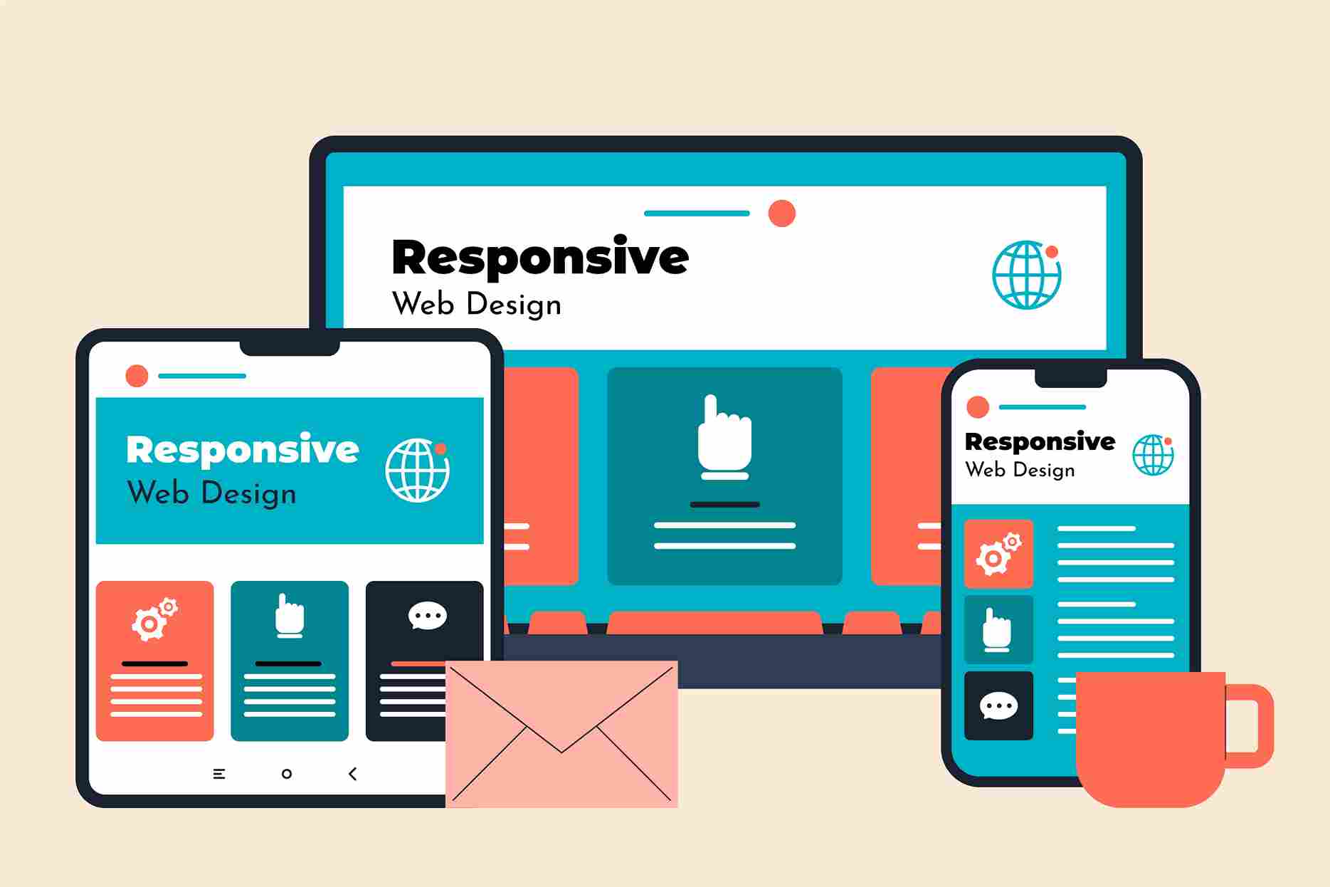
📌 Introduction
Have you ever opened a website on your phone and had to pinch and zoom just to read the content? Frustrating, right? That’s exactly what responsive website design solves. Whether you’re viewing on a phone, tablet, or desktop, a responsive site adapts seamlessly—giving users the best experience no matter the screen size. At AverisDigital.com, we specialize in creating responsive websites that not only look great but also convert better (Responsive Website Design Examples).
In this blog post, we’ll walk you through real-world examples of responsive website design, what makes them effective, and how Averis Digital implements these best practices for clients.
🎯 What Is Responsive Website Design?
Responsive website design means your site’s layout, images, text, and functionalities automatically adjust based on the device or screen size the user is viewing it on. Instead of building separate mobile and desktop sites, one responsive site can serve them all.
✅ Why Responsive Design Is a Must in 2025
- Improved User Experience
- Better SEO Rankings (Google LOVES mobile-friendly sites)
- Higher Conversion Rates
- Faster Loading Times
- Lower Bounce Rates
If your website isn’t responsive, you’re probably losing visitors and sales.
🚀 Real-Life Examples of Great Responsive Design
1. Averis Digital (www.averisdigital.com)
Why it stands out:
Averis Digital’s site is a perfect example of clean, fast, and fully responsive design. Whether you access it on a laptop or a smartphone, the interface remains smooth, visually engaging, and easy to navigate. The homepage adjusts beautifully with CTA buttons, animated sections, and service highlights that scale proportionally.
Responsive Highlights:
- Lightning-fast mobile load time
- Sticky headers and CTA buttons
- Adaptive service sections and testimonials
- Mobile-friendly navigation and forms
If you’re looking for professional website design, Averis Digital delivers exceptional results tailored for your brand.
2. Trello.com
Trello’s interface adjusts based on screen real estate, making it simple to use their project management tools across all devices. Cards, boards, and menus scale automatically.
3. Canva.com
Canva’s design platform manages complex design features with a clean UI. Even with tons of features, it remains responsive, fast, and easy to use on any screen.
4. Spotify.com
Spotify uses flexible grids, media queries, and scalable visuals. From music browsing to playlist management, the mobile experience mirrors the desktop.
5. Booking.com
A powerhouse in the travel industry, Booking.com has nailed responsiveness. Their booking flow and filters adjust perfectly for small screens.
💡 Features That Make a Website Truly Responsive
📱 Flexible Grids
Use percentage-based widths instead of fixed pixels. This allows sections to resize fluidly across different devices.
📐 Media Queries
CSS media queries help detect screen size and apply styles accordingly—ensuring consistency across screen types.
📷 Scalable Images
Images resize automatically to fit different screens. You’ll never see a cropped or broken image on a responsive site.
🖱️ Touch-Friendly Elements
Buttons, forms, and menus are designed with mobile users in mind. Tap targets are large, and spacing avoids accidental clicks.
📋 How Averis Digital Designs Responsively
At Averis Digital, we focus on user-first design that scales. Here’s how we do it:
- Mobile-First Approach – We start with the smallest screen and scale up.
- Custom UI/UX Design – Tailored interfaces that are easy to use.
- Performance Optimization – Compressing images, reducing code bloat, and streamlining elements.
- Cross-Browser & Device Testing – We test your site across iOS, Android, Chrome, Safari, and more.
- Conversion-Focused Design – Every button, layout, and animation is designed to guide your visitors to take action.
Looking for a partner to build your responsive site? Let’s talk.
📊 SEO Benefits of Responsive Website Design Examples
Responsive design isn’t just about user experience—it’s a major ranking factor. Google prioritizes mobile-friendly websites in search results.
How it helps:
- Lower bounce rates = better rankings
- Improved page load speeds
- Mobile usability is now a core ranking metric
- Easier to manage one site vs. multiple device-specific sites
💬 Final Thoughts
Your website is often the first impression potential customers get. A non-responsive website? That’s like showing up to a business meeting in pajamas. Don’t lose credibility—or conversions—just because your site isn’t mobile-ready.
Responsive design is no longer optional—it’s the standard. Whether you’re running a service-based agency, eCommerce brand, or personal portfolio, investing in responsive web design is one of the smartest decisions you can make today.
Want expert help? Get in touch with the team at Averis Digital—we’ll help you build a website that works, no matter the device.
📞 Call us at: +91 9910 368 366
📧 Email us: Namaste@AverisDigital.com
📲 Follow us on Instagram: @AverisDigital
🌐 Or visit AverisDigital.com for a free consultation.
🙋 Frequently Asked Questions (FAQs)
Q1: How do I check if my website is responsive?
Use Google’s Mobile-Friendly Test tool or simply resize your browser window to see how your layout adapts.
Q2: Is responsive design the same as mobile design?
Not exactly. Responsive design adjusts across all screen sizes. Mobile design is focused only on smartphones.
Q3: Can I convert my existing website into a responsive one?
Yes! At Averis Digital, we specialize in redesigning static or outdated sites into fully responsive platforms.
Q4: Does responsive design improve SEO?
Absolutely. Google gives ranking preference to mobile-friendly, responsive sites.
Q5: How much does a responsive website cost?
Costs vary depending on features and complexity. Contact Averis Digital for a customized quote.